


A self-portrait of Dorothy Delong, photographer
CASE STUDY
Brand Identity & Web Design
Dorothy Delong is a photographer who shared her work primarily through her Facebook page. Upon gaining popularity on social media, Dorothy wanted an official online portfolio to sell her work to clients.
Brand Identity & Web Design
Dorothy Delong is a photographer who shared her work primarily through her Facebook page. Upon gaining popularity on social media, Dorothy wanted an official online portfolio to sell her work to clients.
Project Type: School project
Tools Used: Adobe Photoshop, Adobe XD, Google Fonts
Role: Designer
Date: 2022
Tools Used: Adobe Photoshop, Adobe XD, Google Fonts
Role: Designer
Date: 2022
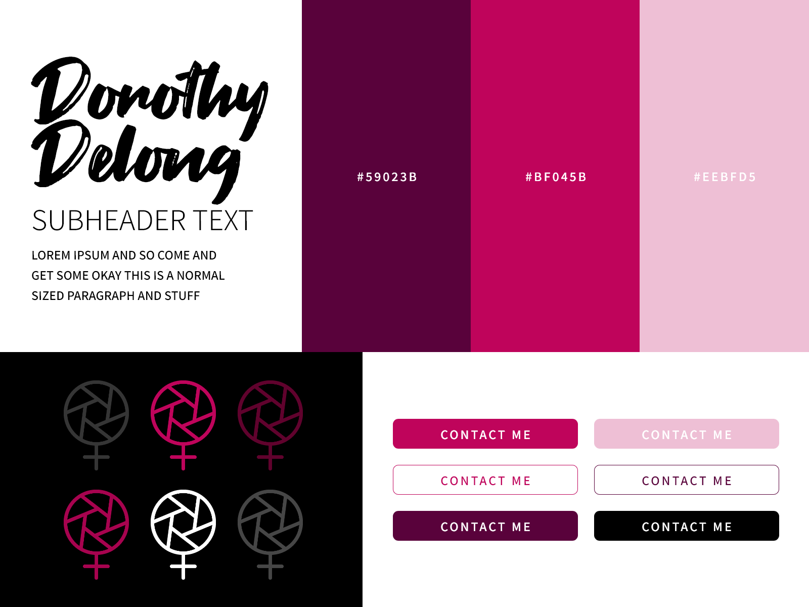
Brand identity
The client had an existing brand through social media and a logo that visualized her business as a photographer and her feminist values.
I understood that my goal was not to re-design her existing brand but to enhance it.
The color pink is most commonly associated with optimism, innocence, and femininity. It made sense to give a feminist photographer who captures candid moments of female empowerment a monochromatic pink color scheme. The client and I agreed that there's nothing wrong with embracing feminine aesthetics. This is also why a handwritten script for the type made sense as well.
While Dorothy has exciting, action shots in her body of work, for the purposes of her website design, I chose a color block look overall that would resonate with her future clients while maintaining that same excitement.
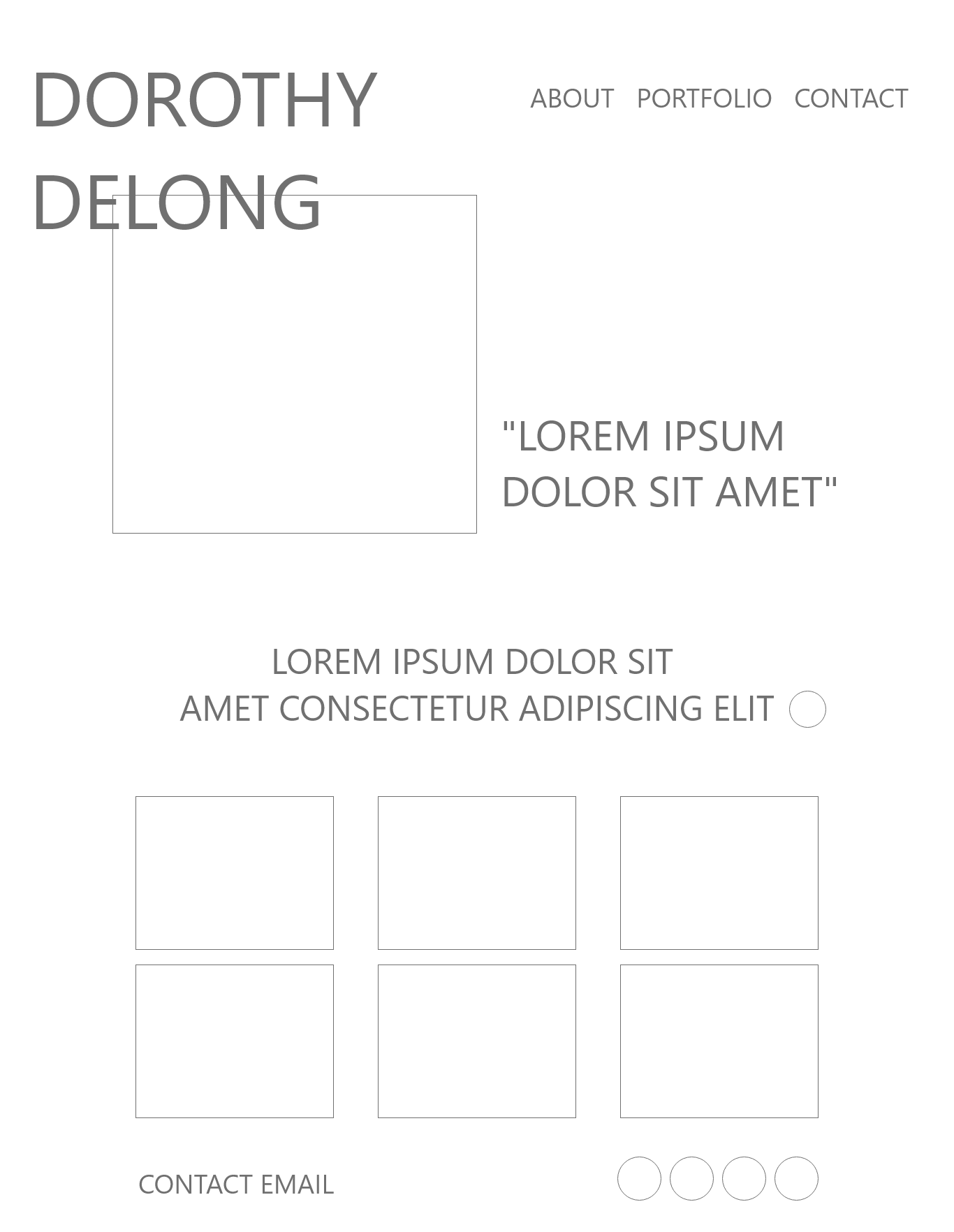
The lo-fi digital wireframe
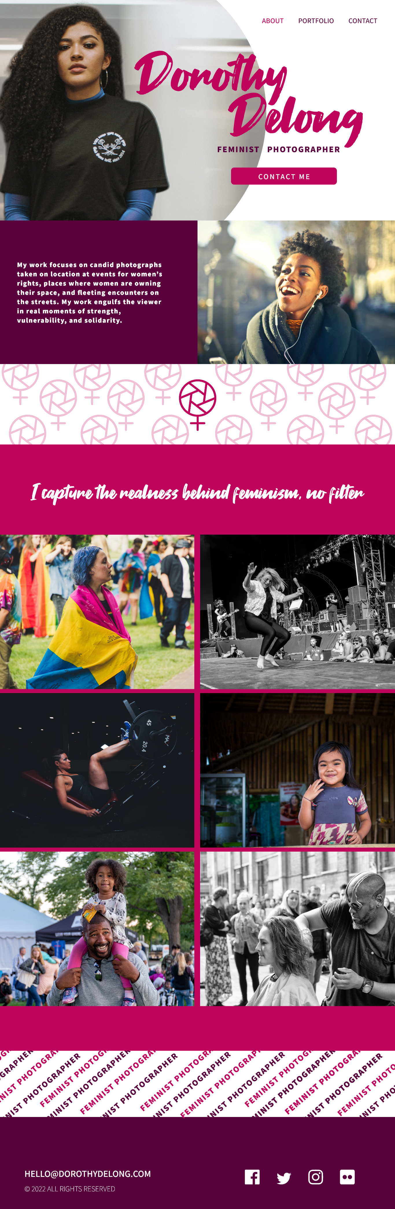
THE FINAL PRODUCT
I went with a clean color blocked look that's a little alternative instead of a semi-gritty design. The client's target audience are magazine editors and gallery owners, therefore I wanted those potential customers to feel as if her look was familiar to a magazine spread or a gallery exhibition.
The final deliverable is a design for Dorothy's portfolio website that captures her personality, displays her work, and will attract the attention of future clients.
THE FINAL PRODUCT
Dorothy's Final Website Design
The final deliverable is a design for Dorothy's portfolio website that captures her personality, displays her work, and will attract the attention of future clients.
Dorothy's Final Website Design
The final deliverable is a design for Dorothy's portfolio website that captures her personality, displays her work, and will attract the attention of future clients.
Dorothy's finished website design